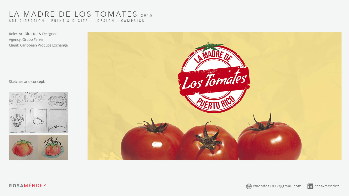
As the art director for this project, I was entrusted with the responsibility of designing a unique concept and logo for the campaign. I drew inspiration from old posters and advertisements from Puerto Rico and used a yellow-tone background to contrast well with the red tomato and the logo. The round emblem design aimed to convey a sense of official recognition, emphasizing the accomplishment of Puerto Rico in producing top-quality products, like the fresh and authentic tomatoes grown on the island, while encouraging consumers to support local farms.
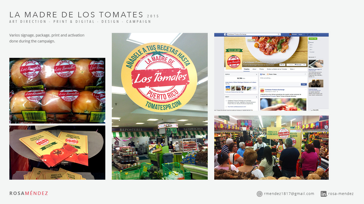
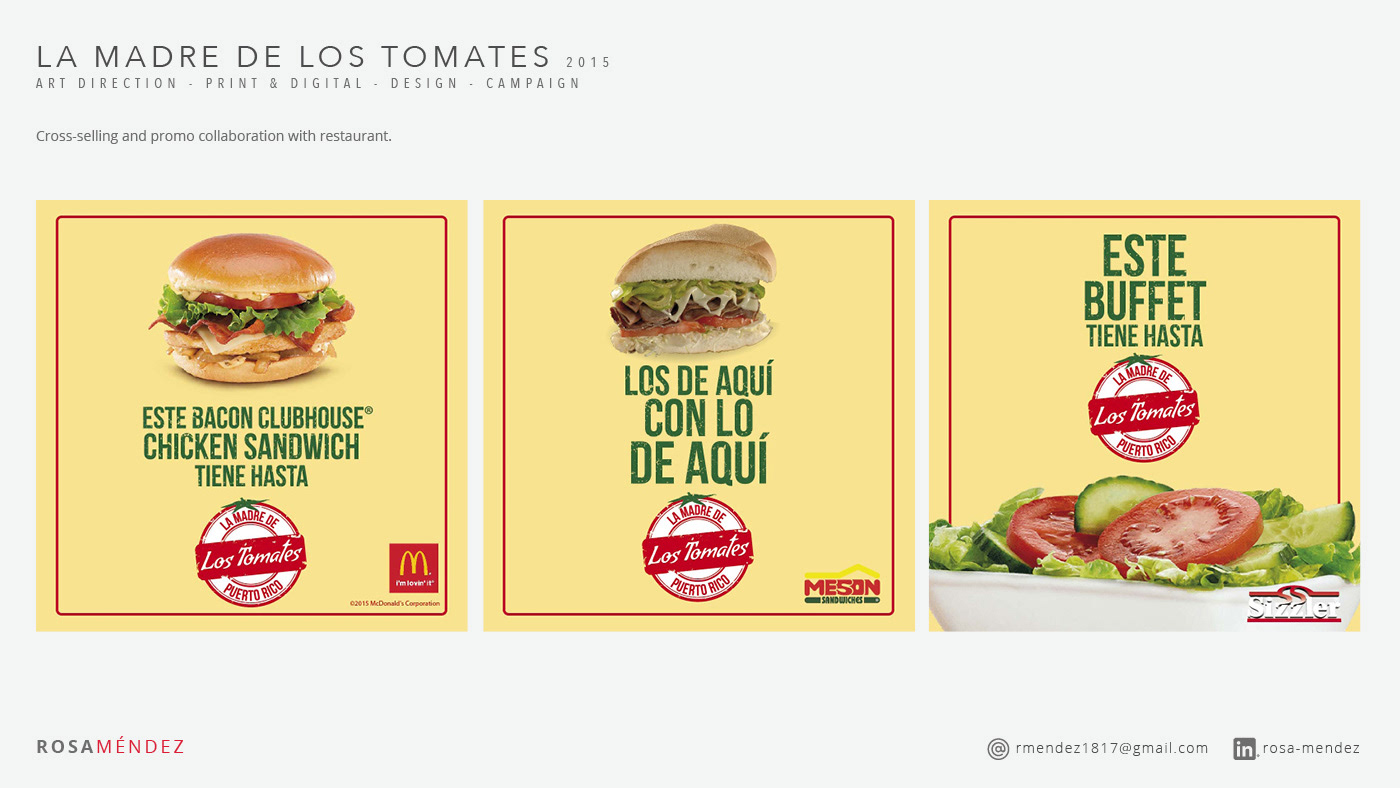
The campaign sought to evoke feelings of patriotic pride, celebrating Puerto Rico's accomplishments in various fields such as sports, arts, and agriculture. Centered around the notion that the Puerto Rican tomato is the "Mother of Tomatoes," this campaign highlighted the exceptional freshness, quality, and flavor of the tomatoes harvested on the island by local hands. By forging partnerships with well-known brands, the campaign aimed to increase awareness of the benefits of consuming fresh, locally-grown produce and to encourage consumers to incorporate tomatoes into their daily diet, making them an essential item on their shopping lists. Participating brands included Amigo, Ballester Hermanos, Burger King, Church's Chicken, Econo AM, Inc, Econo Levittown, Econo LHV, El Mesón Sandwiches, Mc Donald's, Plaza Loíza, Ponderosa, Ralph's Food Warehouse, Sam's Club, Sizzler, Subway, Supermax, Plaza Supermarkets, Walgreen's, and Walmart.
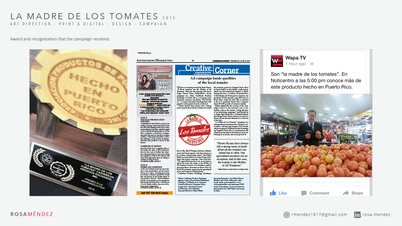
The success of this campaign was further solidified when it received the "Impulso a la Agricultura Local" (Breakthrough to the Local Agriculture) award in 2015, presented by the Association of Products Made in Puerto Rico. As a testament to its effectiveness, sales grew by 15% following the launch of this campaign, demonstrating the power of creative design and a strong message in driving consumer engagement and support for local agriculture.